Monday, May 26, 2014

Bootcamp Assigment 3 - Editorial

Once upon a time I was an Art Director for a publishing company. Madison Publishing created customized health care magazines for insurance companies. I loved that job. I worked alongside some amazing people and got to hire lots of talented illustrators and photographers. And I got paid to do it!

So when Lilla Rogers gave us an article on meditation to illustrate for this month's editorial assignment in Make Art That Sells Bootcamp, I felt right at home. Except this time I had to do the illustrating and not the hiring.

I am never short on ideas, so I thought I would approach the assignment in two ways. Meditation makes me think of an illustration style that is rich and layered, organic and conceptual. But the article was about a woman who had a hard time getting past distractions to have a successful meditation experience (umm, sounds familiar). I wanted to illustrate both of these concepts. Then I would choose which finished artwork to submit to the gallery.


I ended up submitting the first illustration because I loved the colors, layers and textures. Although, I must admit, the second one looks a lot more like me when I attempt to meditate. Which style do you prefer?

You can read the original article here. Perhaps you too, could use a little motivation to meditate? Ohmmmmm.

Thursday, May 15, 2014

Crayon Monsters

When I saw the theme for this week's Spoonflower contest, I really wanted to give it a try—crayon drawn monsters. How fun! Somehow, life got in the way and I didn't get to spend as much time as I would have liked developing the characters. But I had a couple of cuties, so I quickly pulled this pattern together right before the deadline. Check out all the other awesome monsters on this week's Spoonflower contest here. And if you feel inclined to vote for mine, that wouldn't be so bad either!


Some alternate, stronger color ways I created after the deadline:


Monday, May 5, 2014

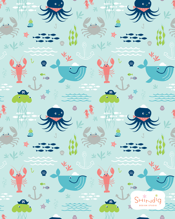
Under the Sea

I recently drew a lobster for a map, which became the inspiration for creating this sea-themed pattern for kids. There are so many interesting things in the ocean I think I could keep exploring this fun theme over and over.


Here I tried the characters with sea-faring hats:


And here's the pattern with type: